I consider myself to be a bit of a paint fanatic. I love paint and I love to makeover our home again and again with paint. But I have to say, out of all of the colors I have painted around our home, these recent paint colors just might be my most favorite of all.
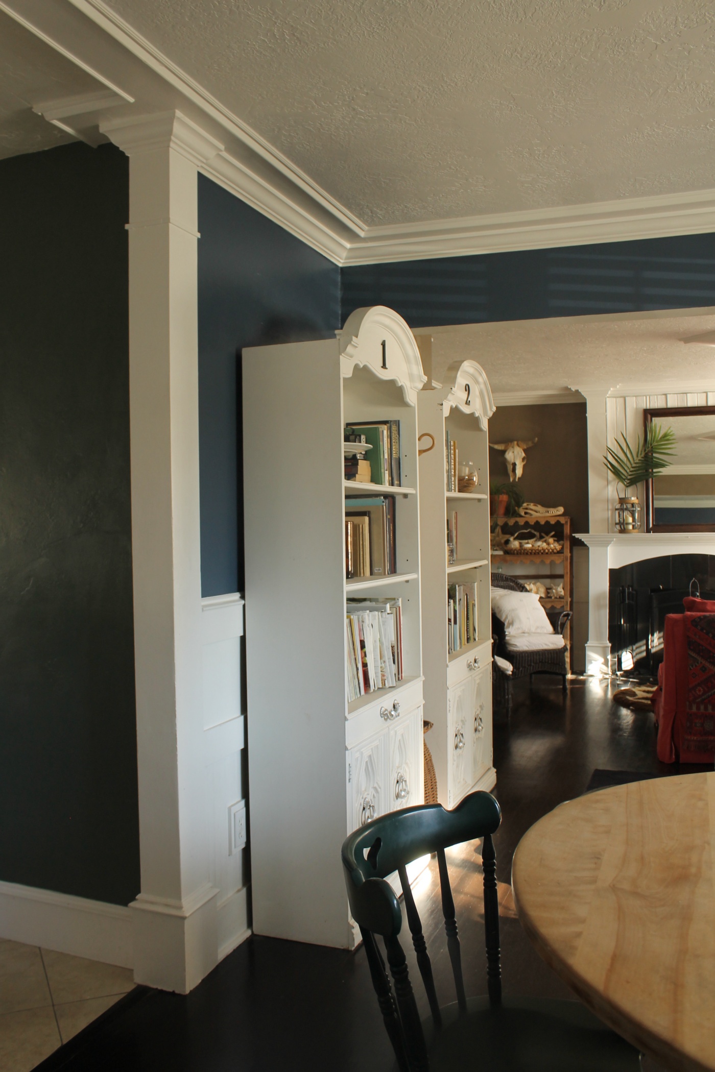
I’ve recently painted our living room, dining room, and kitchen and what I’m loving the most is how the colors all flow together so nicely. The main purpose for re-painting our walls was because I wanted the beautiful white trim and wainscoting that is throughout our home to be more noticeable. I’ve painted our walls in lighter colors in the past which only blended into the trim. Now with the darker colors, the white trim really stands out.
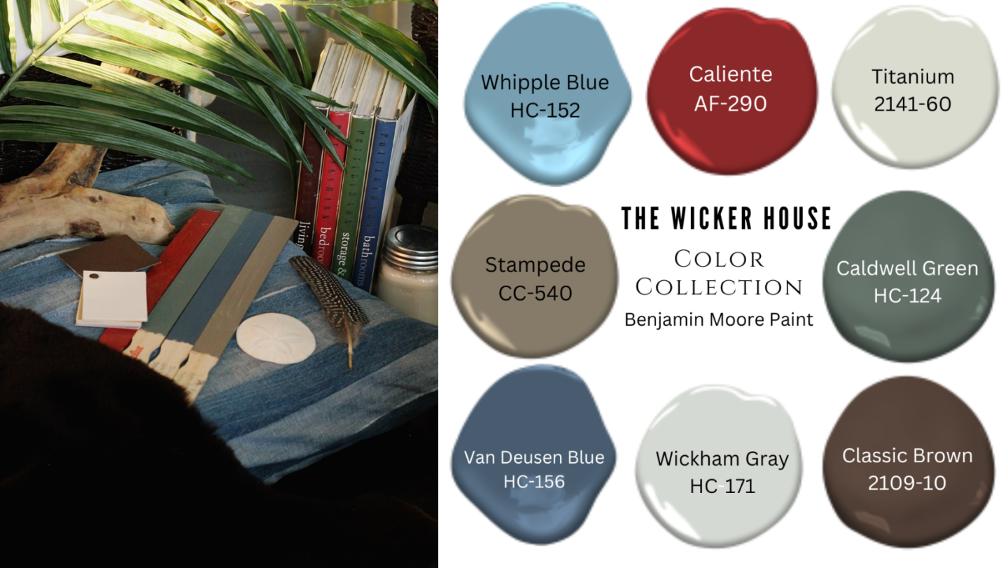
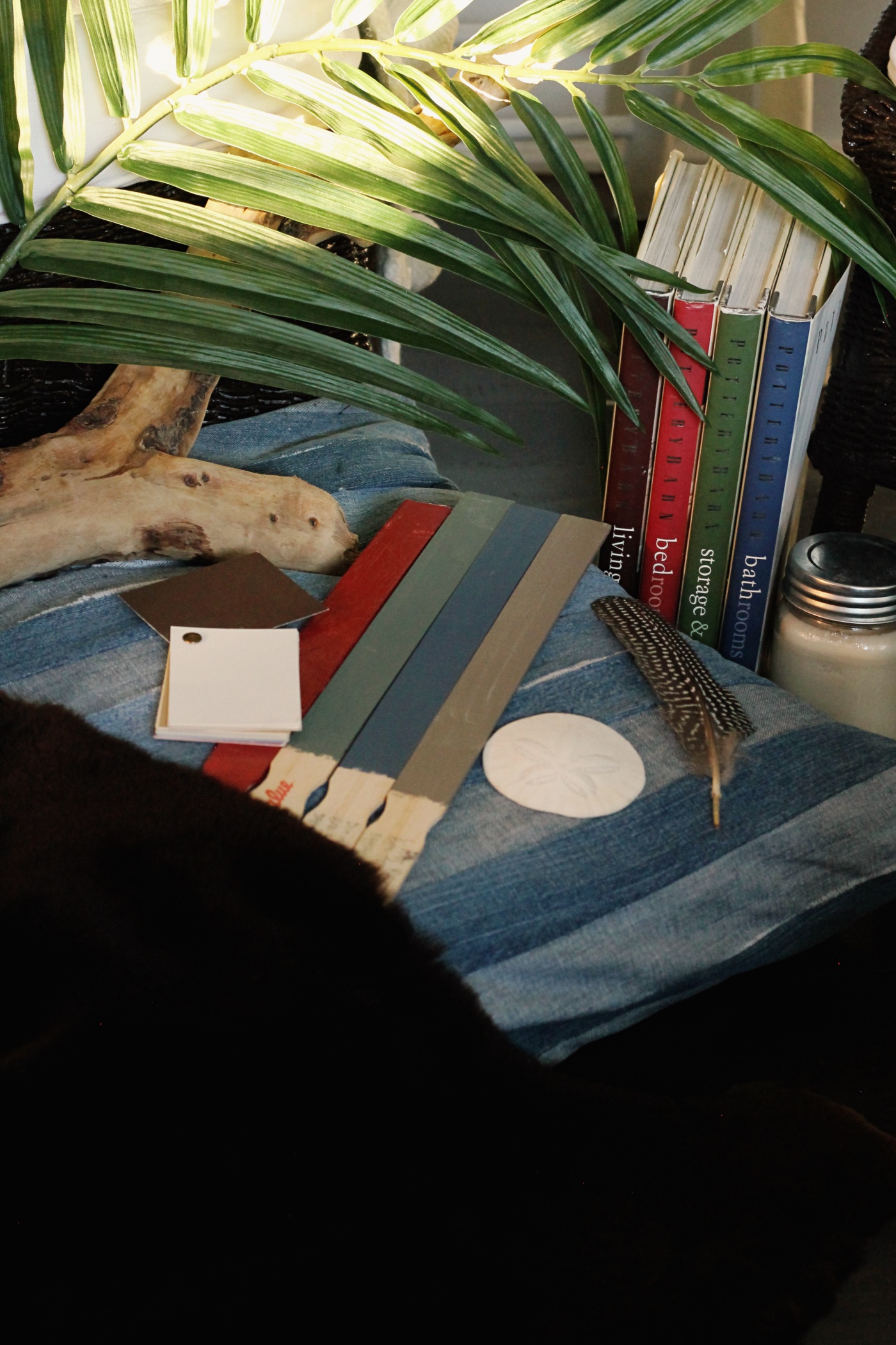
As far as picking a new color scheme for our home, I took notice of my favorite home decor. One of the items being this collection of Pottery Barn Books. I’ve always loved these classic colors on the dust jackets. I have also found a lot of inspiration throughout these books, as well as in my 2000-2010 era of Pottery Barn Catalogs, a time when these colors were more popular. We have a red sectional sofa, dark brown floors, lots of green plants, and I’ve always loved a denim blue, so these colors were already being used throughout our home, but now they are thoughtfully placed together, creating a cohesive color story.
I recommend creating a color story for your own home. It can make decorating so much easier. Simply take notice of the colors in your home and what you are naturally drawn to. Then head to the Benjamin Moore Website and pick out colors you love. I Love the Benjamin Moore Website and find it so helpful. But you can also try other paint websites, or pull together paint chips from your local paint store. Then when you’re out shopping for your home, try to stick to your color palette.
Now I’m going to share each of the colors in our home and tell you a little bit more about each one.
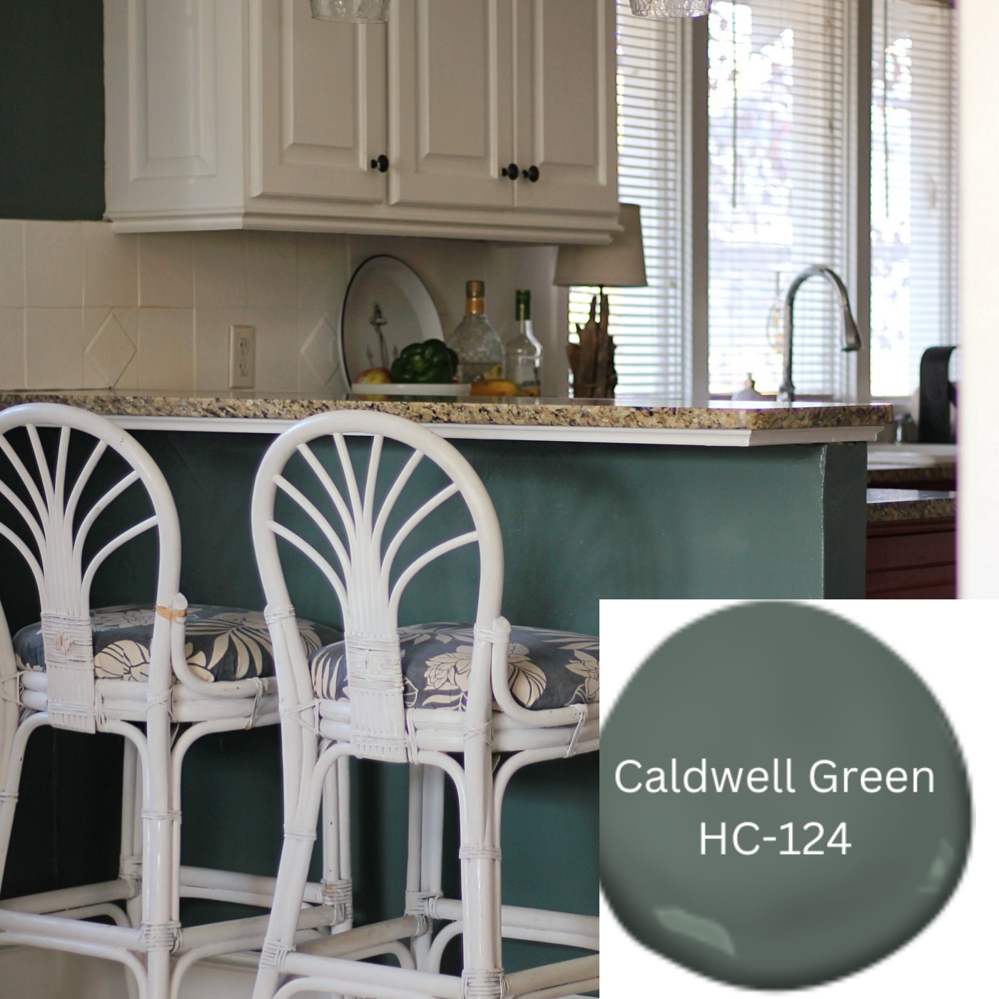
“Caldwell Green is An attractive hunter green with regal blue undertones” -Benjamin Moore. I knew that I wanted to paint our kitchen green, but I also wanted to see how it would look if I left the red on the cabinets. So I felt like this green paired nicely with the red. At least for now, I think I will paint over the red after the holidays.
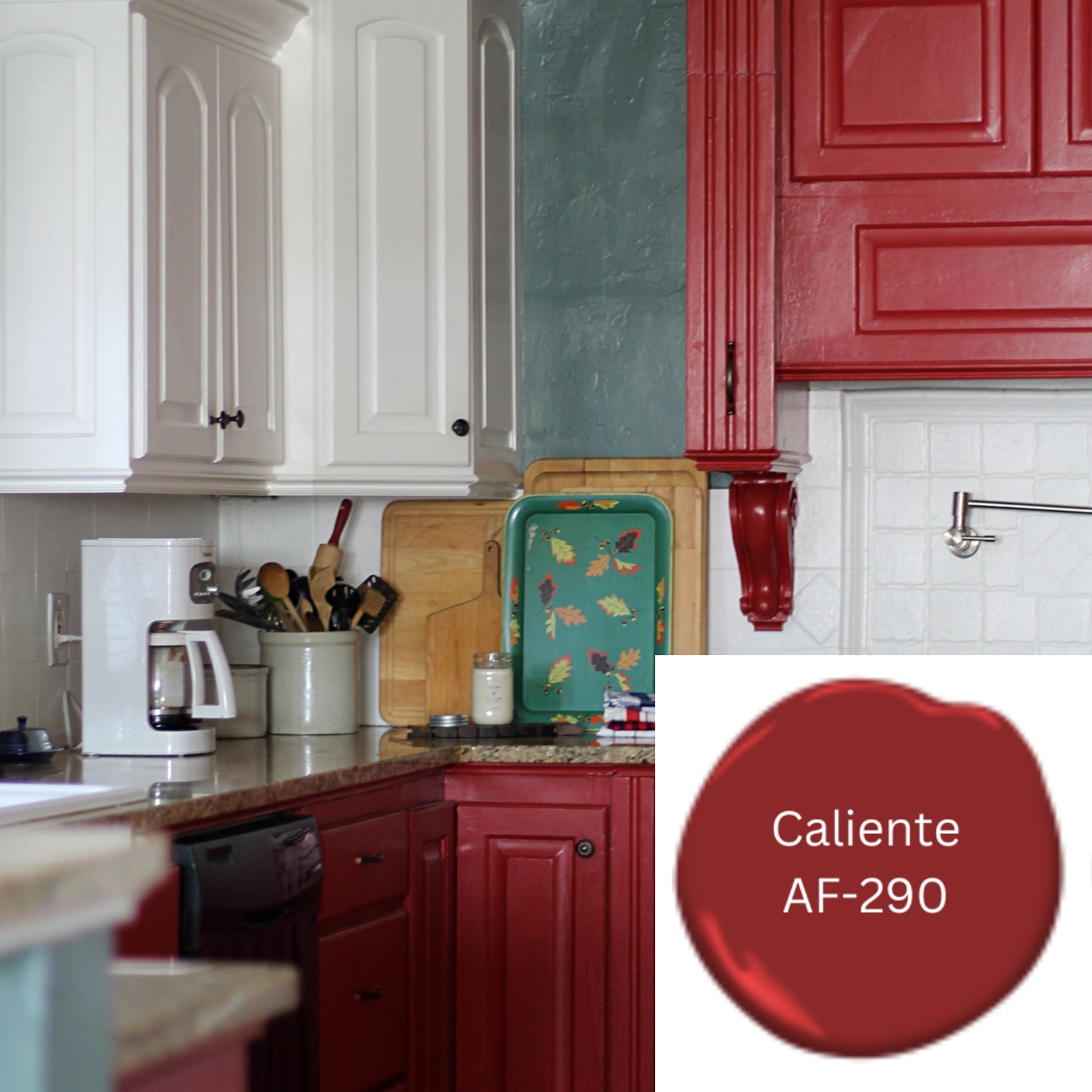
“Caliente is A charismatic, classic shade of red that is radiant and full of energy” -Benjamin Moore. I painted our kitchen cabinets Red last year and have really enjoyed the burst of color it brought to our home. Because our sectional couch in the living room is red, I always felt like the red kitchen felt fitting. I Painted our front door in this color as well, Seen HERE and HERE. This is the Perfect color for a front door.
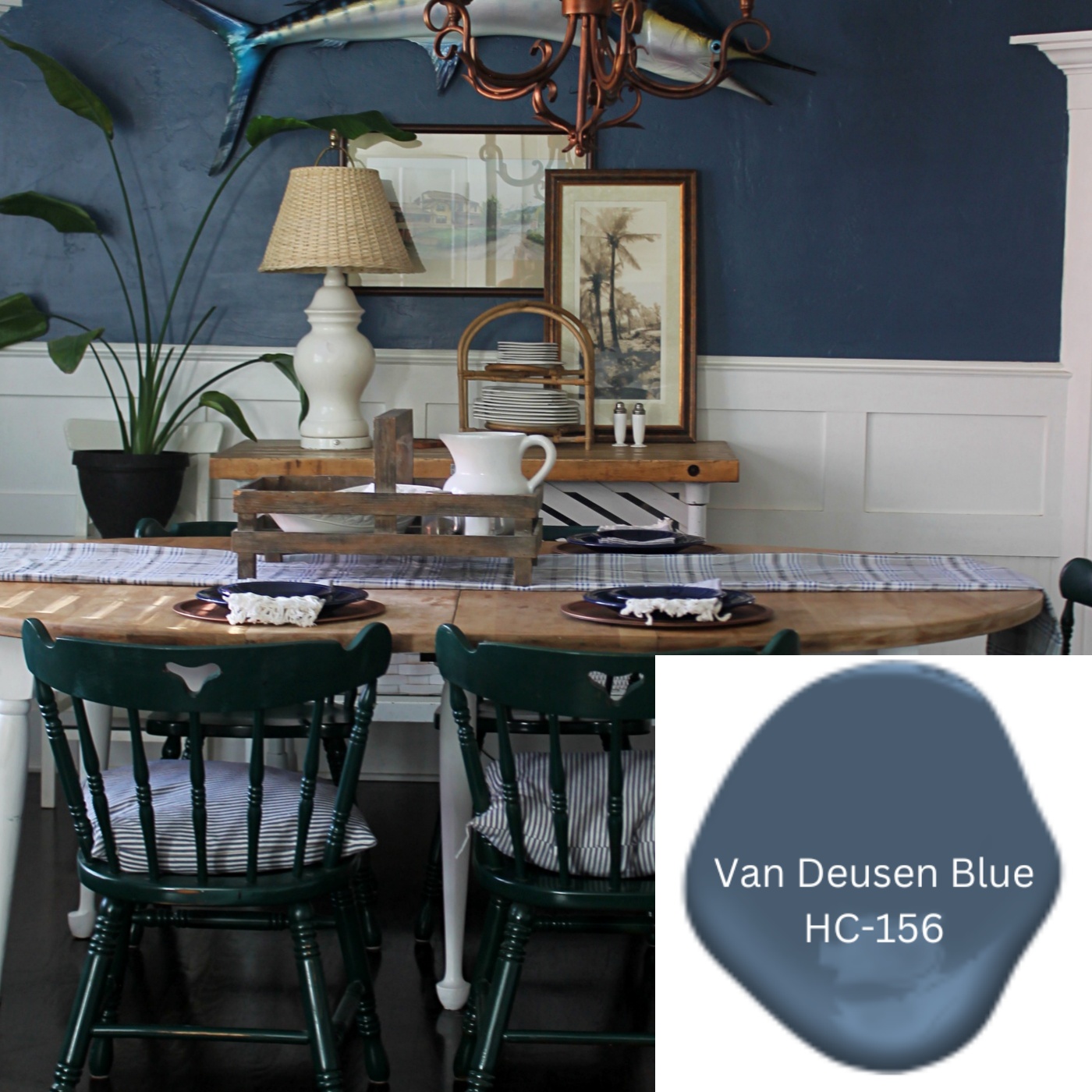
“Van Deusen Blue is A foundational blue color that fits easily into both traditional and modern spaces”- Benjamin Moore. I could not be more in love with this color. Blue is one of my favorite colors and I know that I will never get tired of this beautiful shade of blue. It may just be my favorite color in our whole house, perhaps because it feels nautical to me.
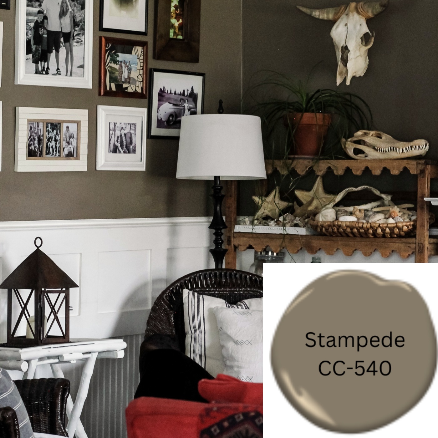
“Stampede is A deep brown enveloped with moss green undertones.” – Benjamin Moore. Okay, to be completely honest, I picked this color from an old Pottery Barn Catalog. Pottery Barn at one time had a collaboration with Benjamin Moore and they would share different colors in their catalogs and this one was always a favorite of mine. At the time this color was named, Texas Leather. This color really gives a warm cozy feeling to our living room.
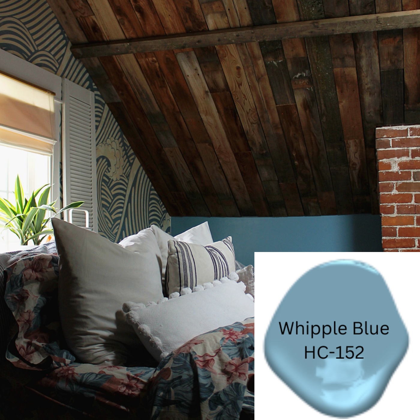
“Whipple Blue is A vibrant cornflower that can subtly energize a space.” – Benjamin Moore. This was the easiest paint color to pick out because I simply matched it from the Wave Wallpaper in our bedroom. Earlier this year, Jake and I made over our bedroom adding the awesome barn wood to our ceilings. (And by barn wood, I actually mean our old fence wood). We love this room, and this color was the cherry on top. The blue grounded the room and tied the whole look together.
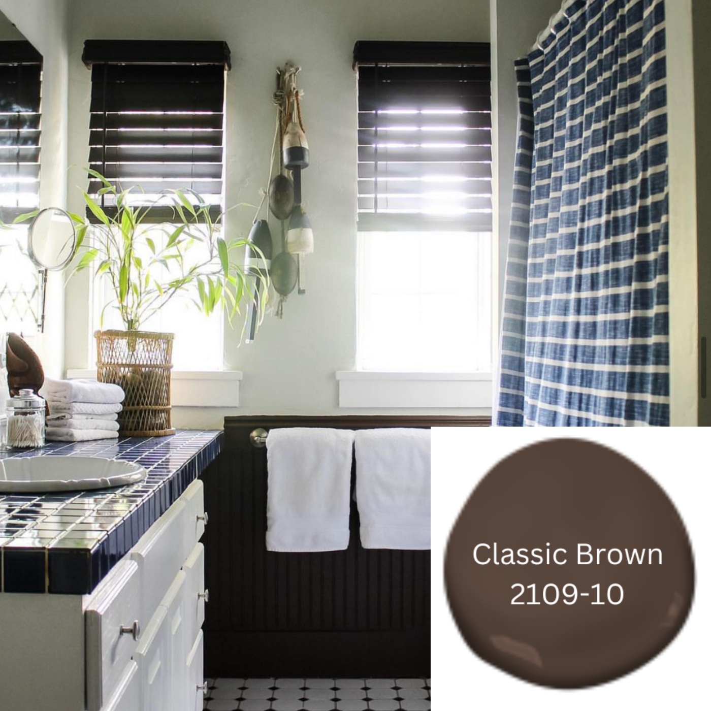
“Classic Brown is A dark, dignified brown that brings a reassuring anchor to any room.” – Benjamin Moore. Earlier this year I made over our main bathroom aka my boy’s Bathroom, and I painted the wainscoting in this dark brown. I love the way it looks with the dark brown blinds. I love this brown, and I’m always looking around our home wondering what else I can paint in it. The color on the walls in this bathroom is Titanium, which I’ll talk about next.
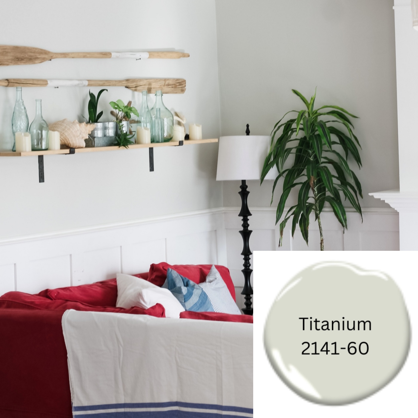
“Titanium is A pale gray awash in blue-green undertones.” – Benjamin Moore. I love this color, I love it so much that I painted our bathroom, living room, dining room and Kitchen in this color. It’s a beautiful light neutral color. But here’s the thing, if you see the above picture, the wainscoting was being blended into the walls. The wainscoting and trim in our home is one of the things I adore most about our home and I decided that I really wanted to showcase it more and so that is the main reason for all of these new darker colors. As soon as I added the darker colors, the white trim became way more noticeable. But that’s nothing against this color; Titanium is lovely, it is also a very close match to the Exterior Color of our House. As Seen HERE.
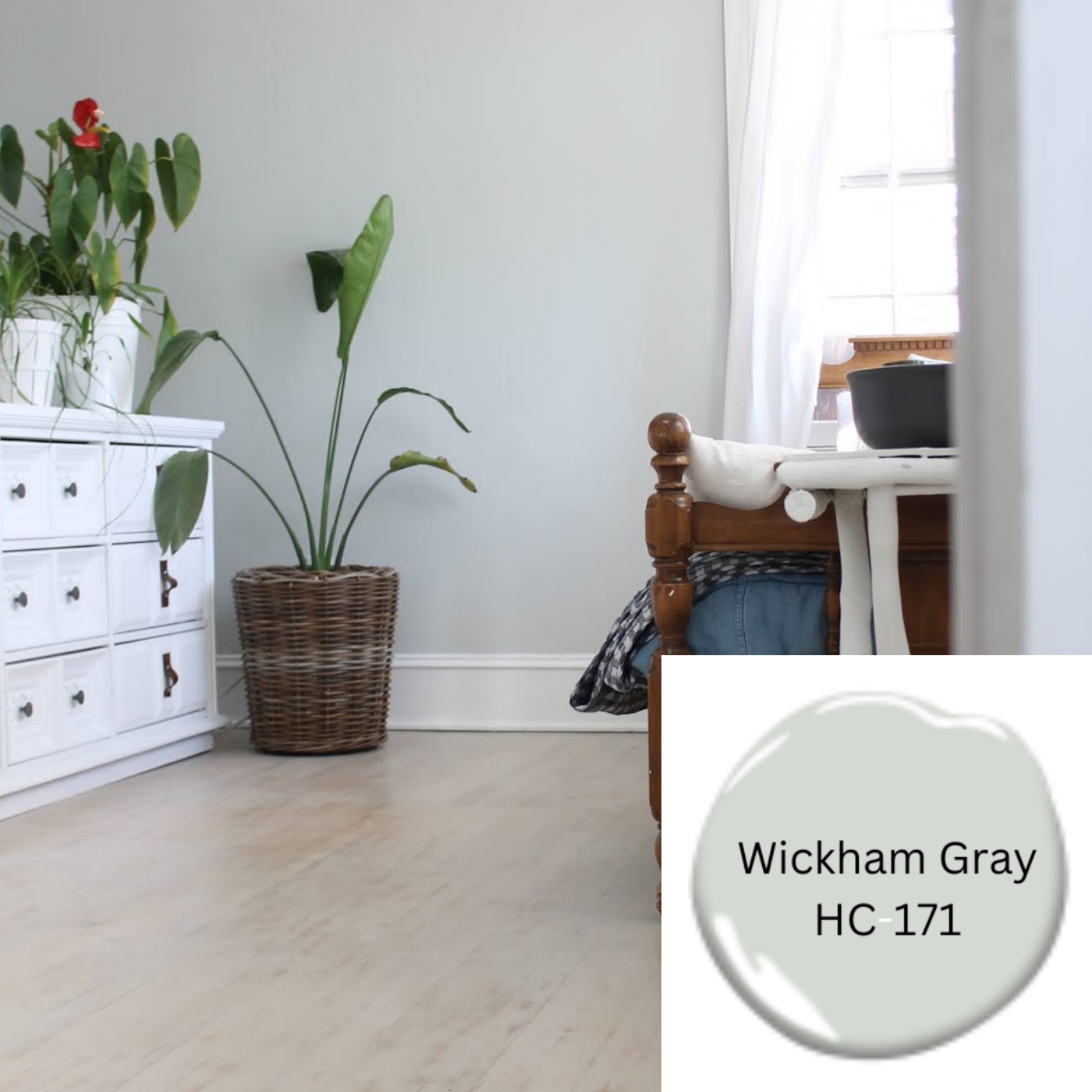
“Wickham Gray is An eye-pleasing gray with buoyant blue undertones” – Benjamin Moore. Okay fun story about Wickham Gray. A few years ago my family and I rented a cute little airbnb on the beach and I fell in love with the paint color. As soon as I returned home I messaged the host asking if she would share the paint color and she did! 🤗 This color is the perfect Beach House Color. I know it looks similar to Titanium, but Wickham Gray has more blue in it. So As soon as I found out the name of the color, I painted our sunroom in it. My oldest son moved his bedroom into the sunroom so it looks a little different these days, but I still wanted to share this color because it’s a favorite of mine.
Okay wow, this may have been the most wordy blog post I’ve ever written. I usually like to keep my post short and simple, but I had a lot of information to share with you today. Don’t get me started talking about Paint colors, I’ll never shut up. HA! 😂
Have any Questions or comments? Please let me know below or email them to me at thewickerhouse@yahoo.com or come find me on Facebook and/or Instagram
And remember, you are welcome to PIN any of the Images from my blog on PINTEREST. Find a Pin It button by hovering over any of the pictures.
Thanks for stopping by,
Emily

