I have the hardest time choosing paint color.
It is just so overwhelming to me, one because of the mass amount of color choices out there, and second it’s so hard to imagine what one little paint chip will look like on a whole big wall.
Well yesterday I was remindedHEREabout the Color Visualizer feature that Sherwin Williams offers on their website
It is so much fun, It allows you to upload a picture and then try out different color choices.
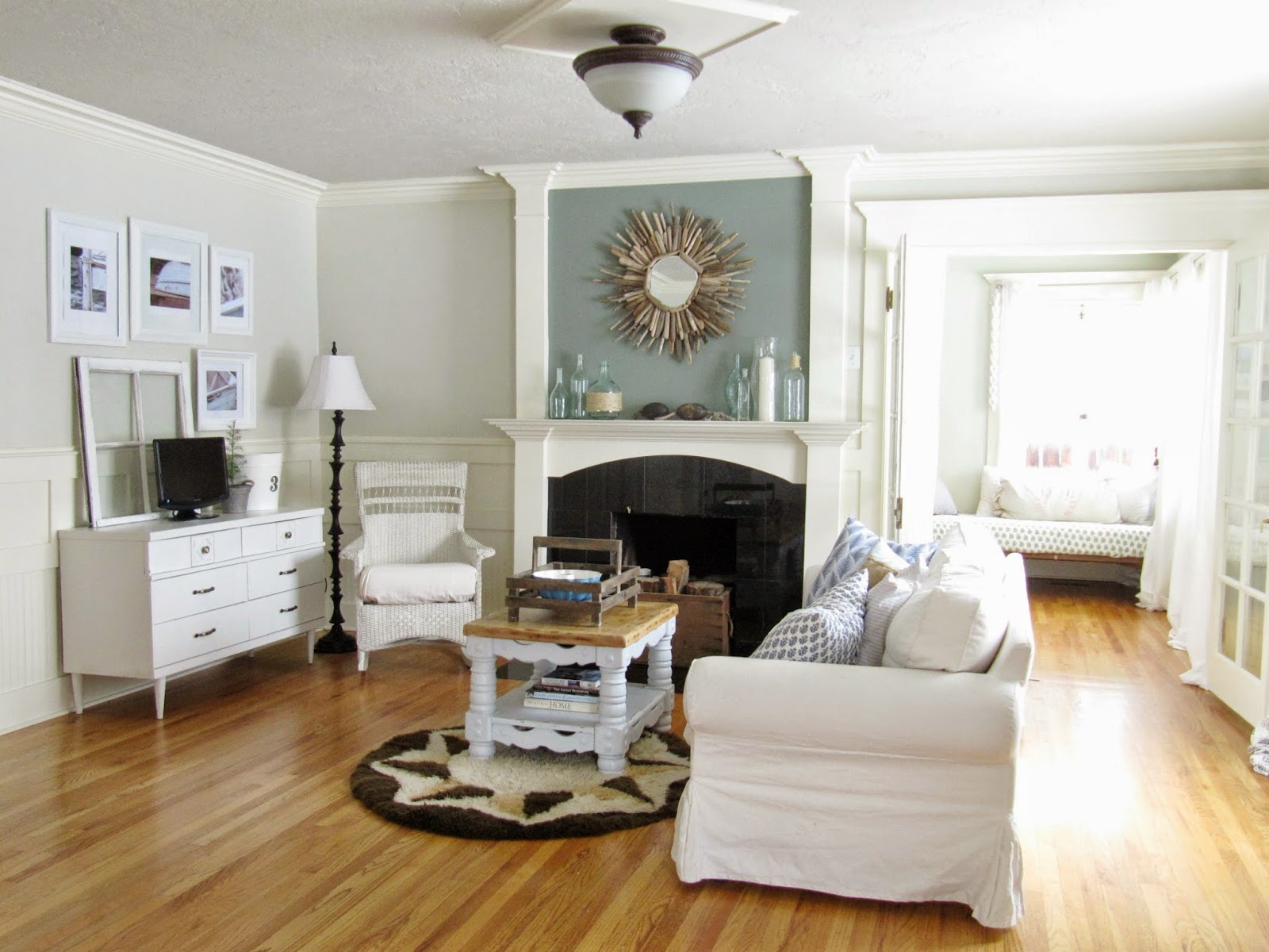
I uploaded our living room.
Here is what it looks like now:

And here is what it looks like in a color called, Needlepoint Navy
Can you believe how different the room looks?
Now I just simply took pictures of my computer screen so the images are not that clear, but you get the idea.
This color here is called, Dutch Tile Blue ( from the Pottery Barn Collection)
I then left the walls as they are now, and just switched out the fireplace color.
So here is the Dutch Tile Blue on the fireplace, not too much different from what it looks like currently
And here I have used the Needlepoint Navy on just the fireplace.
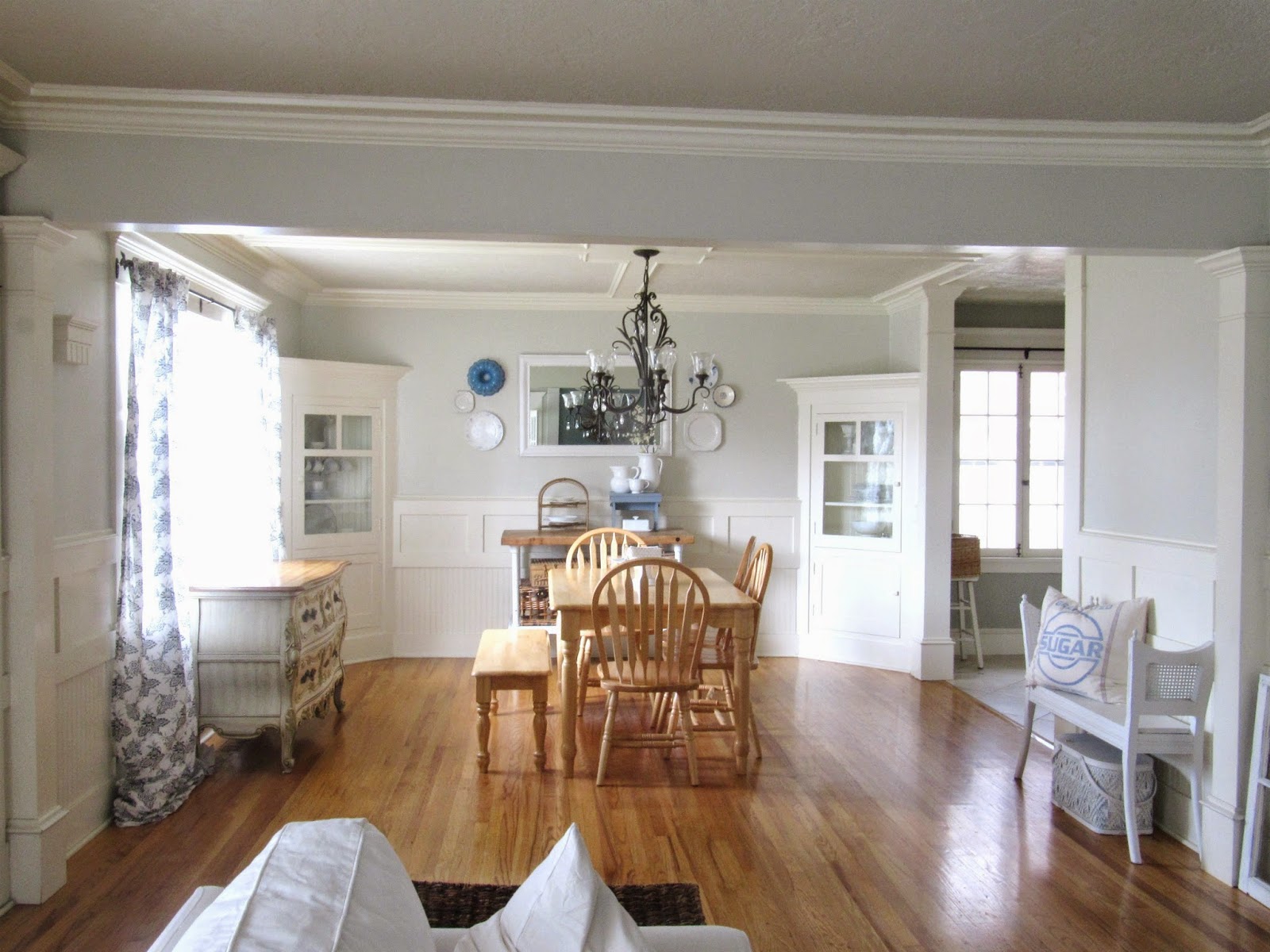
Now because our living room and dining room are one big open space, I also uploaded this picture of our dining room.

Here is what it looks like in Needlepoint Navy:
Here it is in Dutch Tile Blue:
Those two were my favorite colors, so I played around mostly with just them, but I did try out a few other colors, one of which was this one called, Poolhouse.
Fun right?
I don’t know when or if I will actually re-paint these rooms.
But it sure was fun and easy to play with…… now if only actual painting was that simple 🙂
Thanks for stopping by,
Emily

oh that is a fun feature! i love the needlepoint navy on the walls. 😉
I like the Dutch Tile Blue 🙂
I like the space above the mantle. That color is my favorite.
I like the Dutch Tile Blue of the choices though.
I think you should go for it! I have a darker blue in my living room/dining room, with all white furniture, accents, accessories etc. and it looks beautiful! Good luck and I cant wait to see what you choose 🙂
I love that tool! I used it to imagine what our mantel would look like if we painted it. It's definitely helpful!!
I love the Dutch Tile Blue, I vote that color!! 🙂
Very cool ideas thanks for sharing! House Painters