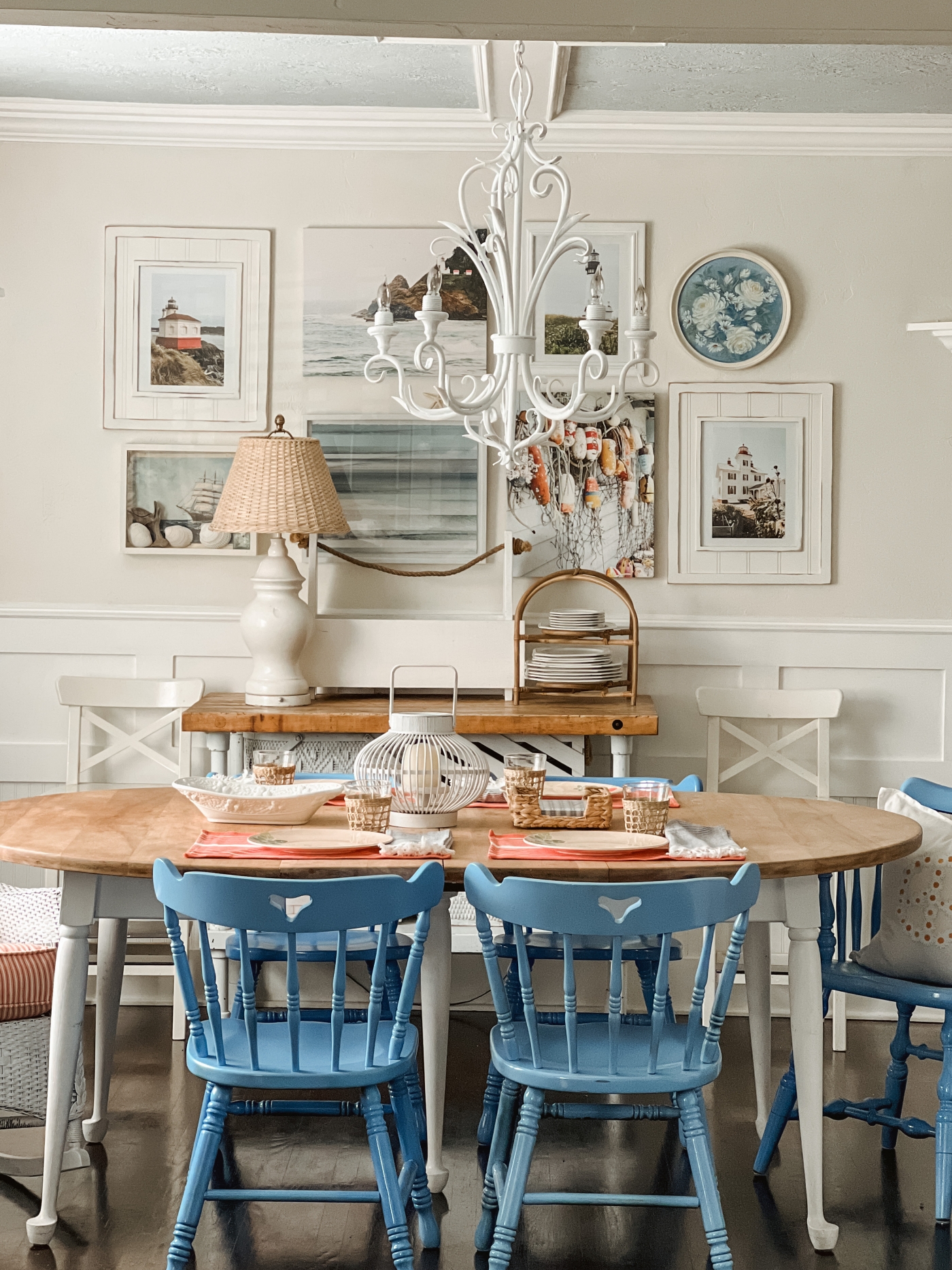
It’s Room Reveal Day! I don’t think I have ever been this excited to share a room makeover with you….well at least not for a while, but today I’m excited because I think our dining room makeover turned out so sweet and I honestly think this room has never looked as charming as it does now.
*Disclaimer: This blog post contains Affiliated links which means that I earn a small commission for purchases made through these links.
So much has changed in this room so let me fill you in with all of the details as we move along.
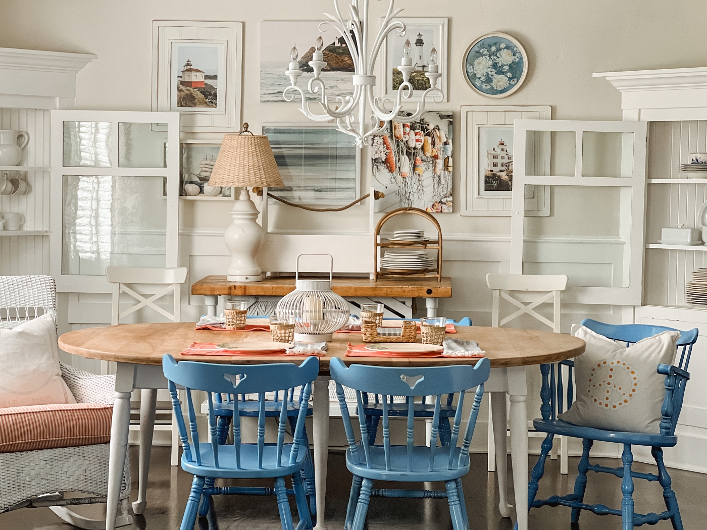
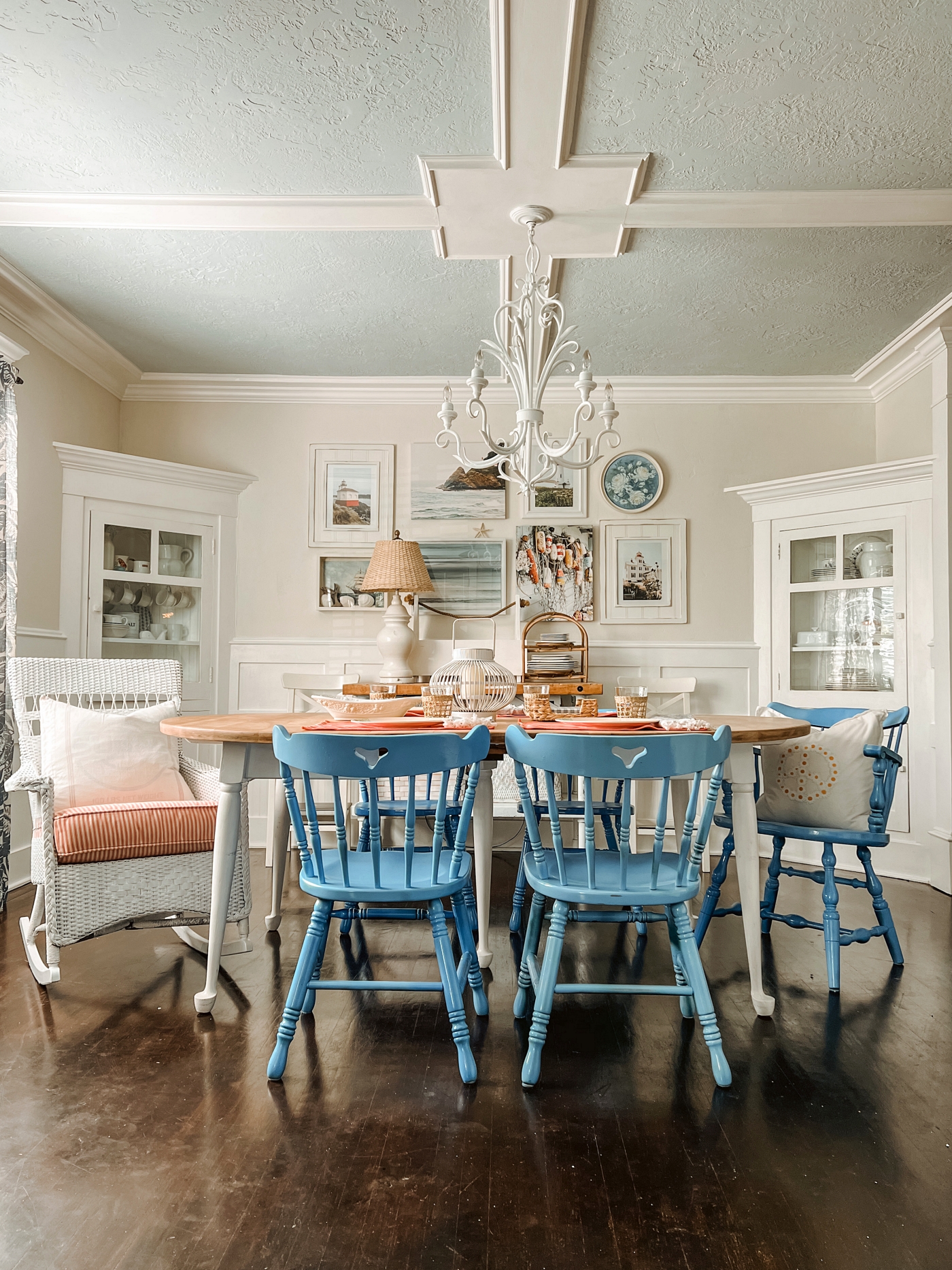
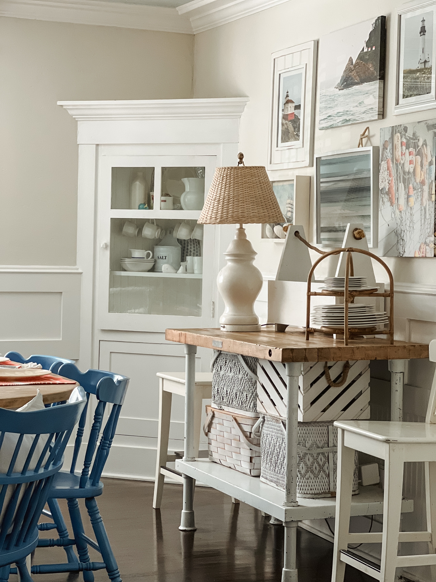
First things first, let’s start with the new paint color. This room was painted navy blue before (seen HERE) and so the new painted walls made the biggest difference. Don’t get me wrong, I loved the navy, color but what a difference it made to go from dark to light. So I first painted the ceiling light blue and once I painted the ceiling all of that pretty ceiling trim stood out. The ceiling was white before and so that beautiful trim molding just blended in, now it is showcased as it should be. The Blue color on the ceiling is named, Lullaby by Sherwin Williams (this color was previously named, Crisp Blue). Next I painted the walls in this beautiful Creamy color. This color is called Tahitian Vanilla by Valspar. Both paint colors were mixed with the Easy Care Paint from True Value.
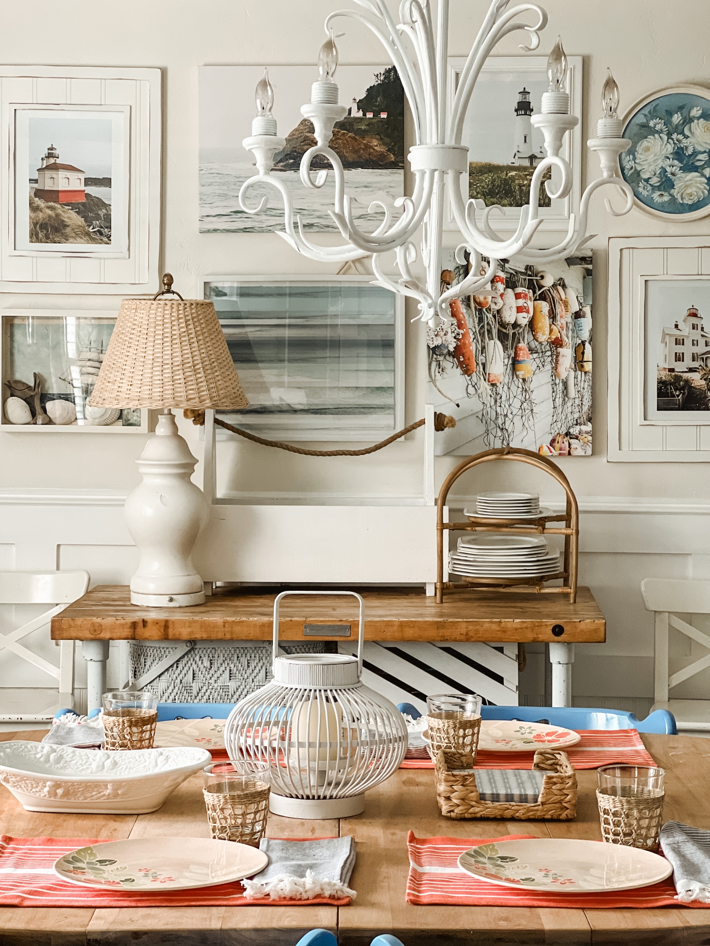
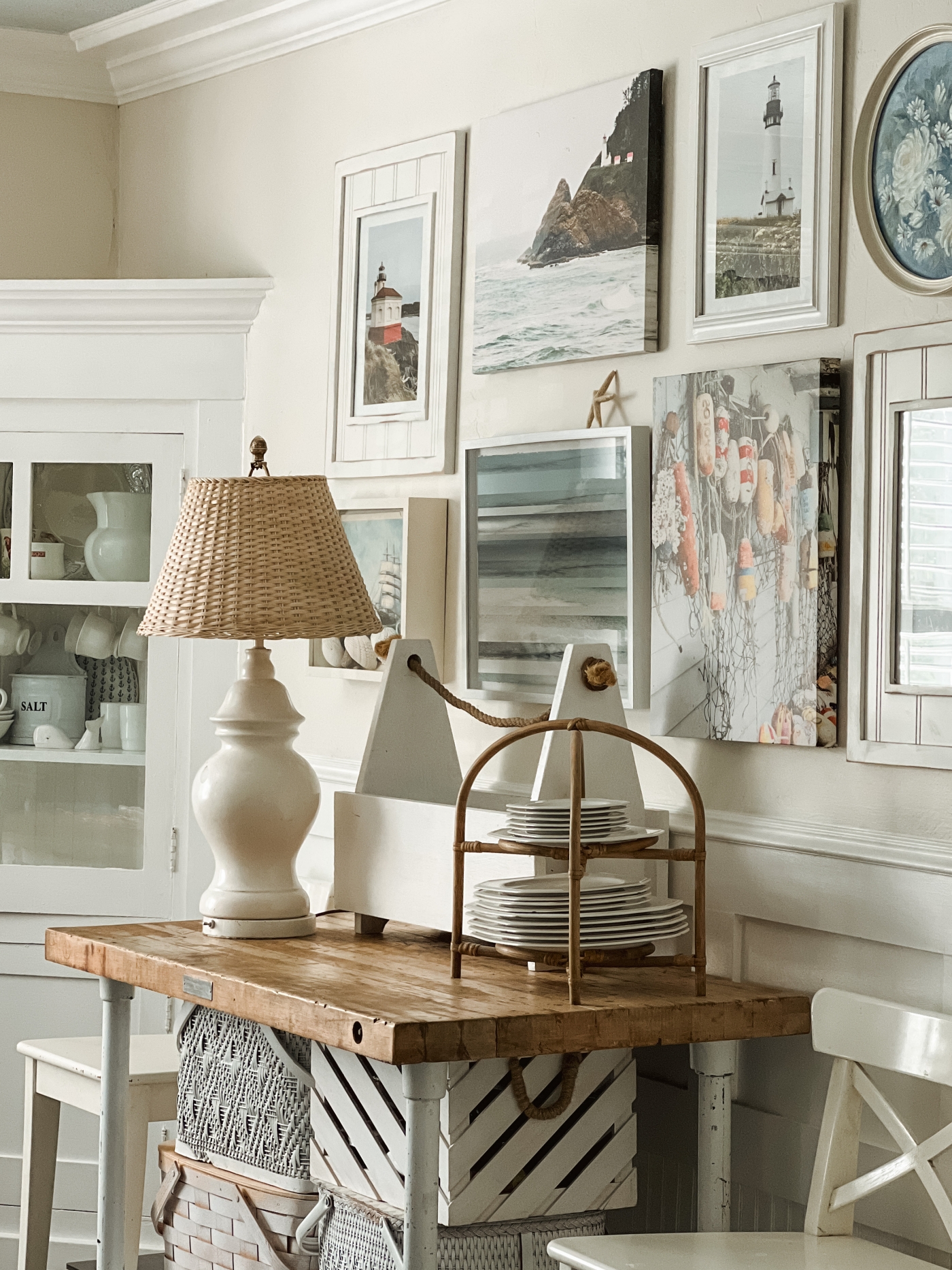
From there I hung up an art gallery wall. I moved the marlin that was hanging here before to our living room, and then I shopped our home for pretty coastal art to hang. I was actually headed in a whole different direction at first. I had laid out all dark brown frames with sepia tone pictures and was just about to hang them up when my teenage son walked in and said, “mom what’s up with all of these dark brown tones, it looks like the 17 century in here”. Granted I was aiming for a British Colonial look, but then my son had me rethinking the whole idea. The reason why I wanted to paint the walls in the first place was because I wanted our home to look like a Coastal Beach House. So from there, I looked around our home and I just happened to have all of this coastal art on hand.
Well I guess at the time I didn’t have that shadow box frame just yet. I did have that ship image framed in a simple black frame, but then soon after I walked by a yard sale and saw the shadow box for sale and so I bought it and switched the art out. I love how this shadow box turned out. I blogged all about it HERE.
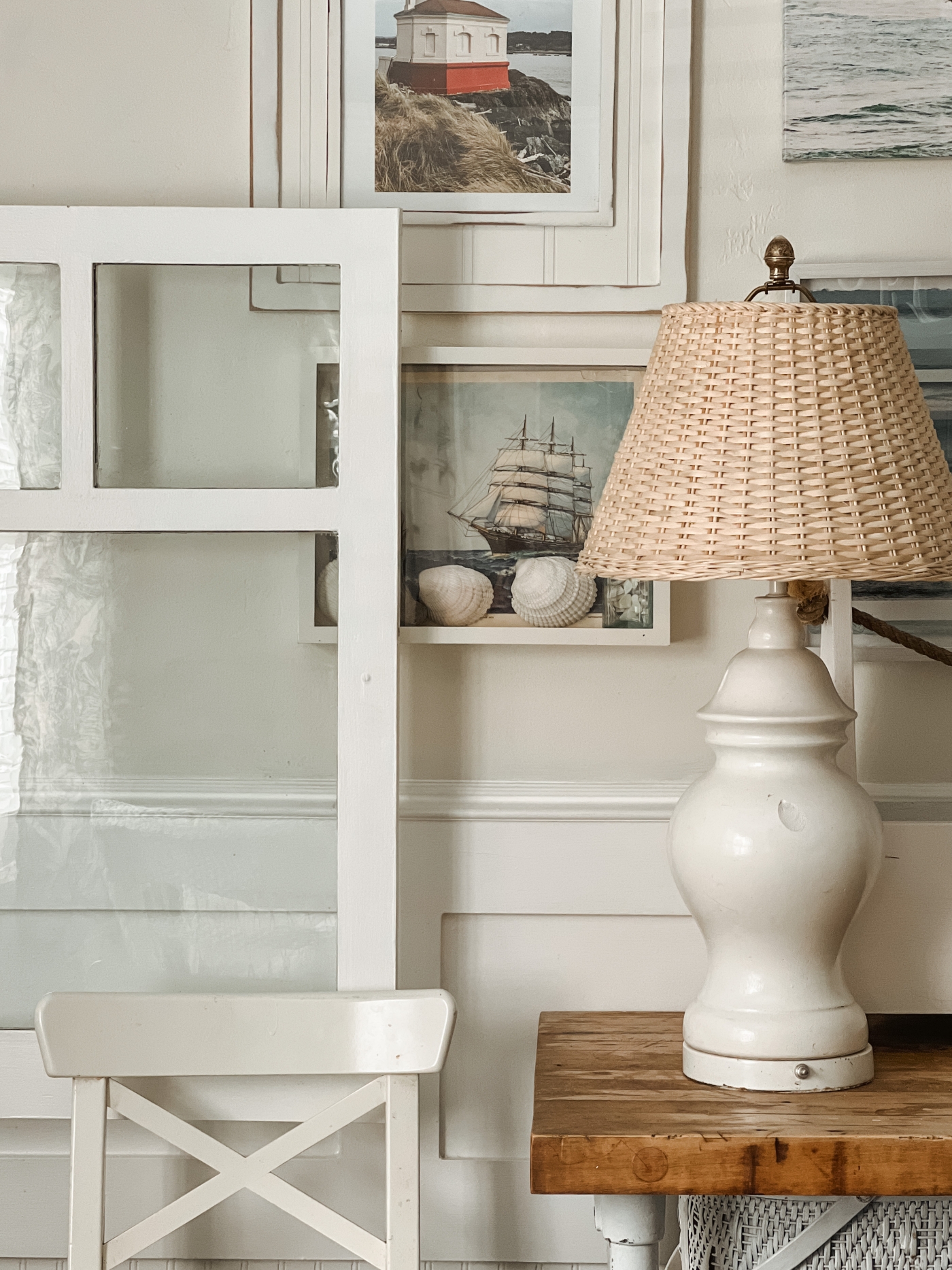
The lighthouse canvas art was a picture Jake took and I put it on canvas from Canvas Pop. (blog post HERE) I also added the picture that I took of the boat buoys (blogged here) to a canvas, this canvas is from Canvas Factory. And then the framed lighthouse pictures are leftover from THIS Display. I love hanging artwork that was taken by Jake or I, it just gives more meaning to our gallery walls.
You may have also noticed that I painted our chandelier white. This is the 3rd time I’ve painted this chandelier. I plan to write a whole blog post about this chandelier and all of it’s changing colors soon. It’ll be fun to compare all of the different looks.
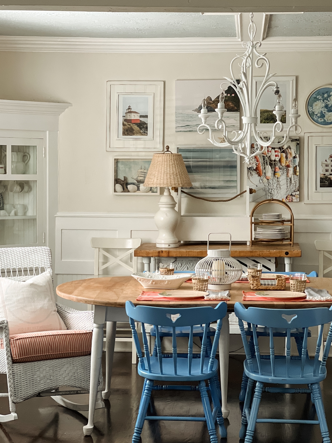
Next up, I painted the chairs, both the wicker rocking chair and the blue chairs. I also believe these chairs deserve a whole blog post just about them, so that will be coming soon too! I was planning on painting the chairs white, but that became a whole thing that I’ll get into in that upcoming blog post about the chairs, but in the end I love the pop of blue and think these chairs turned out so cute!
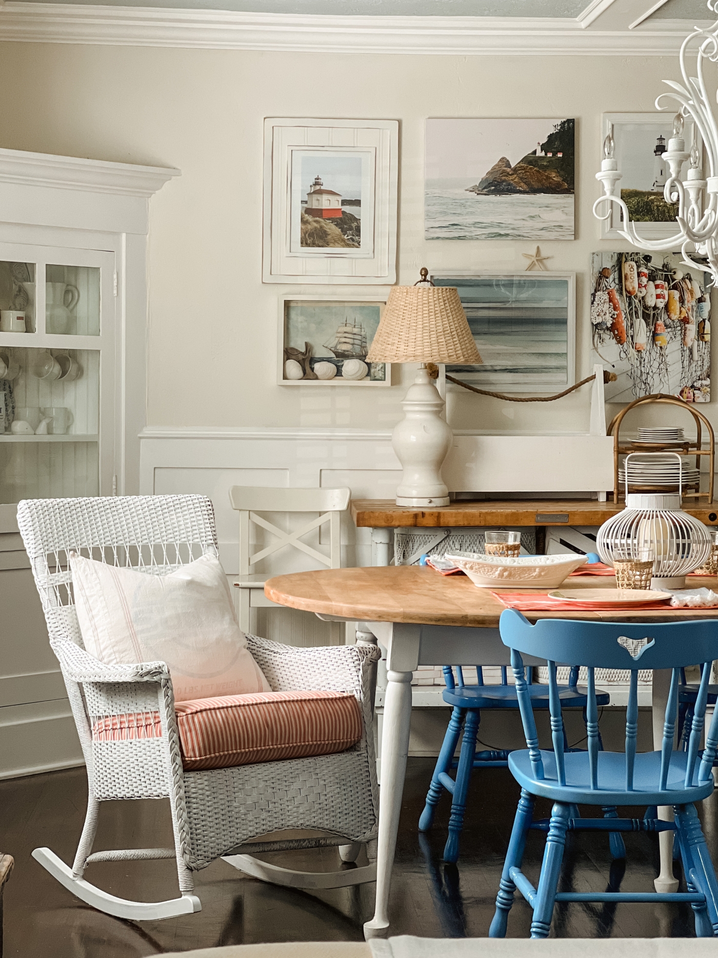
As did the wicker rocker. I love the cottage look this wicker rocking chair brought to our dining room. This chair use to be outdoors but then I realized it was getting damaged from the elements and so I wanted to bring it indoors. TIP: Don’t be afraid to bring outdoor furniture indoors for a new look in your home.
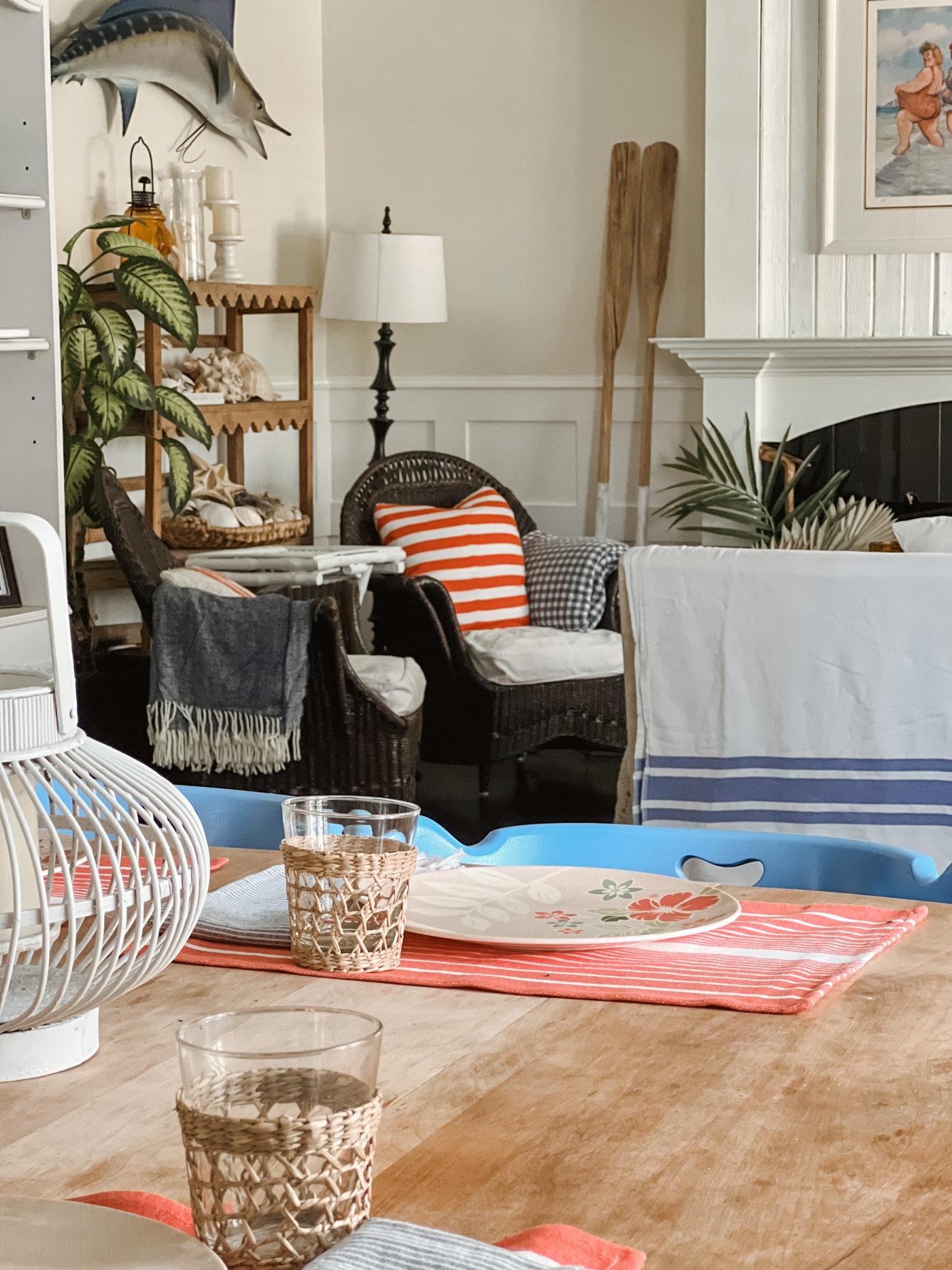
I added a few pops of orange into our dining room and I love how it now looks so cohesive with the living room that is just across the room. The living room also got painted in the same ceiling and wall colors and I already blogged all about that side of the room HERE IN THIS POST.
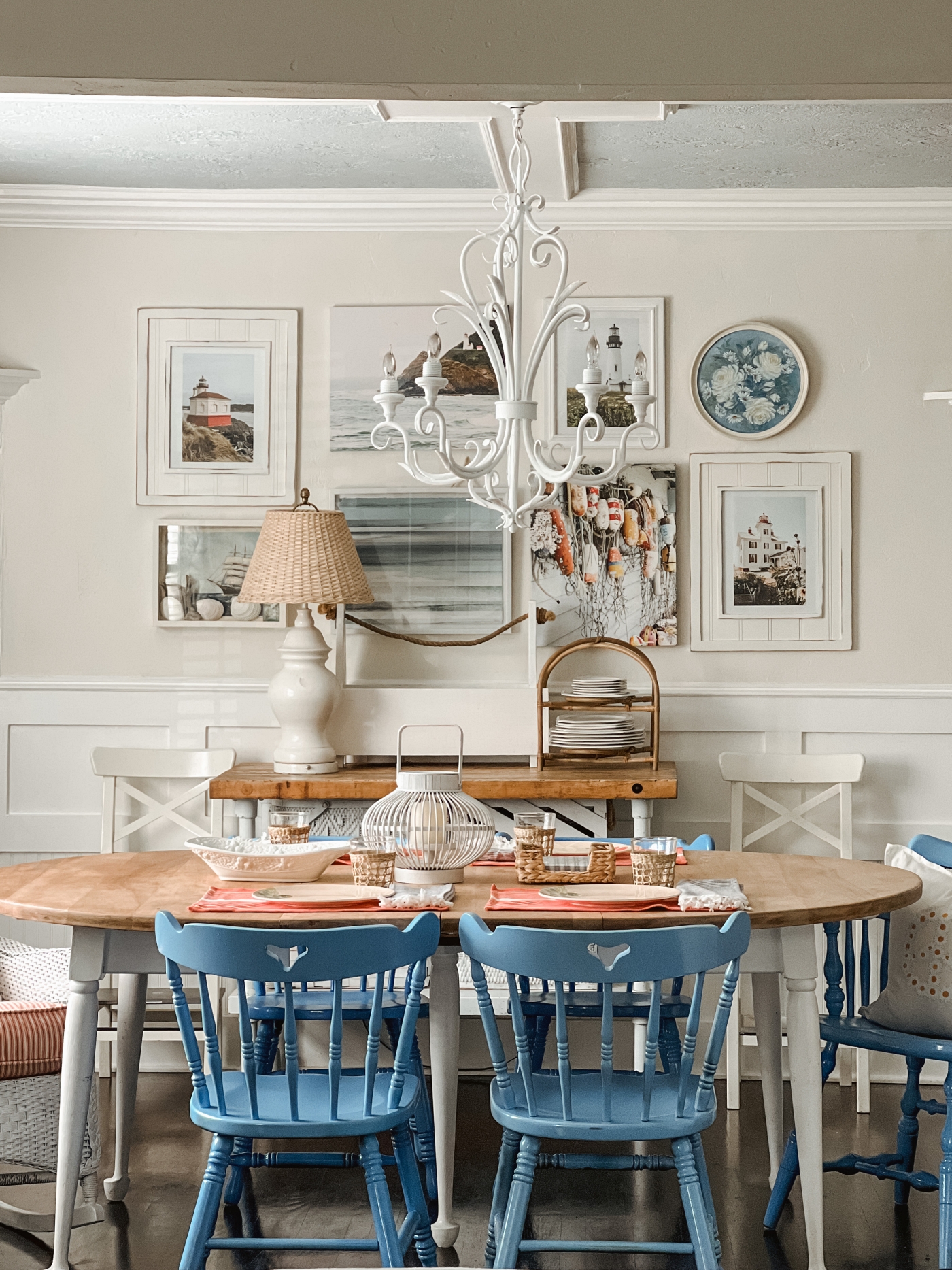
I’m really happy with the new room makeovers, both the living and the dining room. This wall color is so soft and calming, and then the added pops of orange and blue add charm and happiness to the rooms.
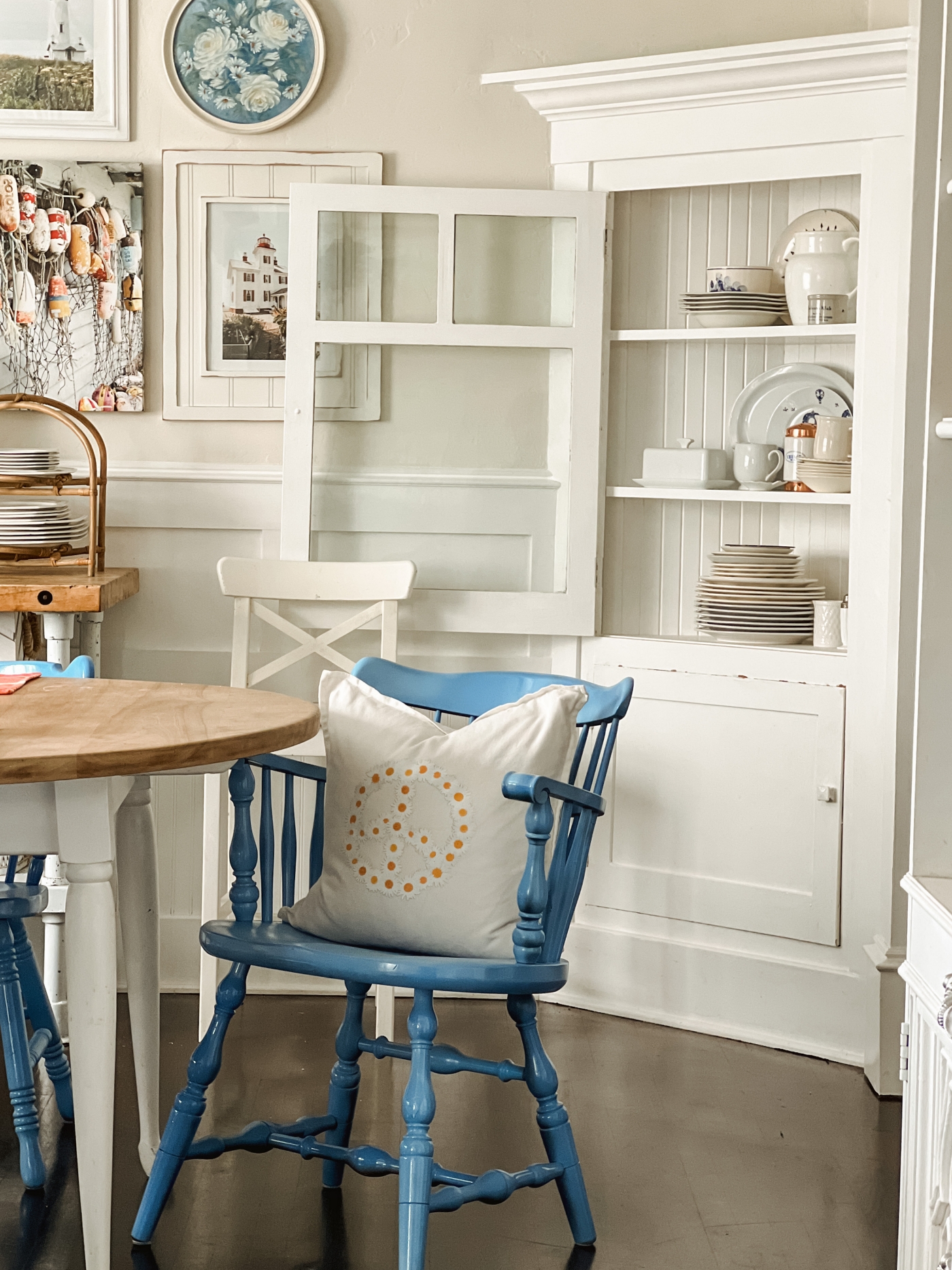
The corner hutches in our dining room are one of my favorite things about this room. They are original to our 1924 cottage home. A couple years ago I wrote THIS BLOG POST about corner hutches with some options that you could add to your own home. I may need to update that blog post since it was written a while back, but this look can be achieved with corner furniture pieces.
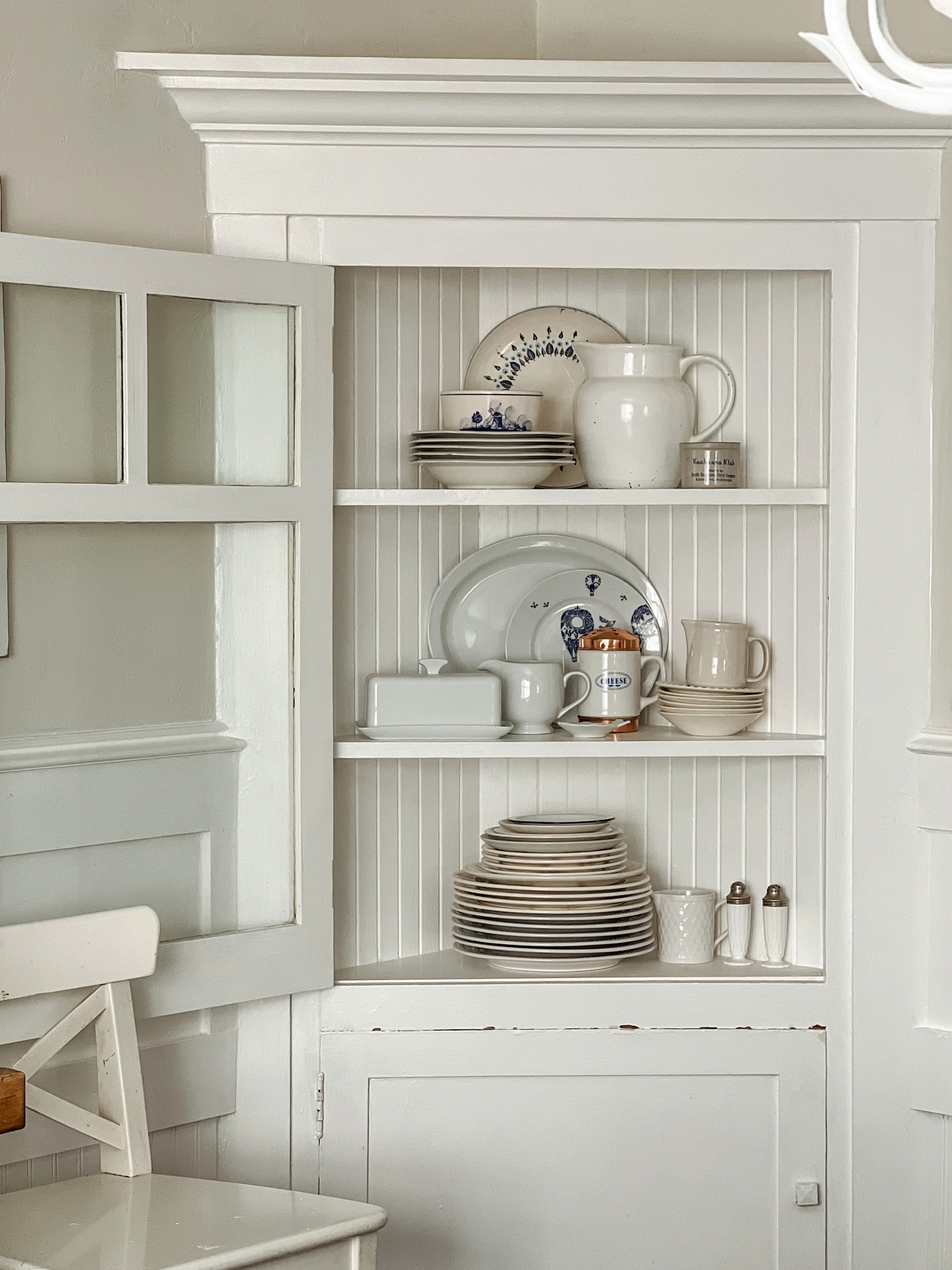
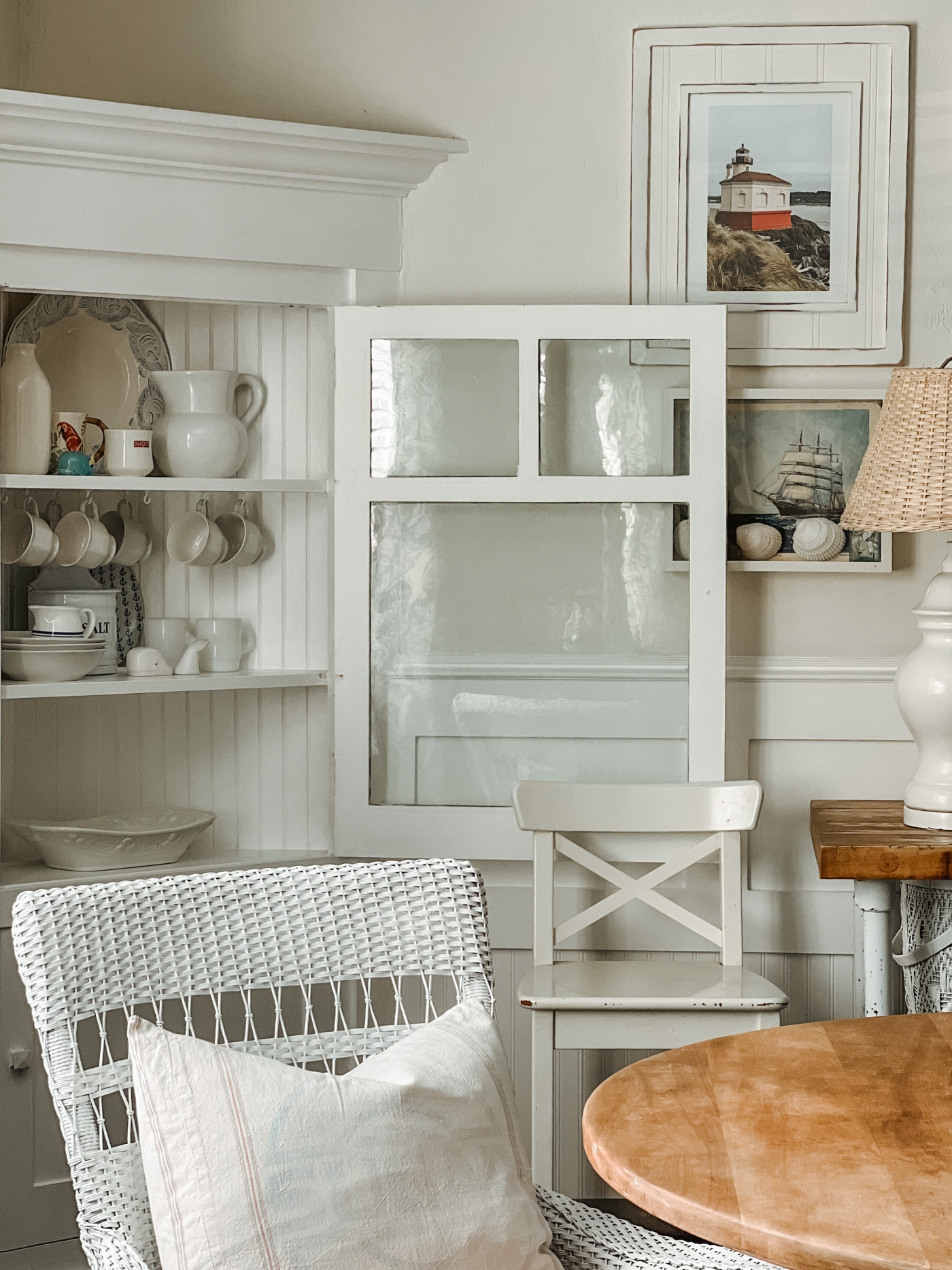
Another thing I love about these corner hutches is that it allows me to pick up cute dishes wherever I go because I know I will always have a place for them.

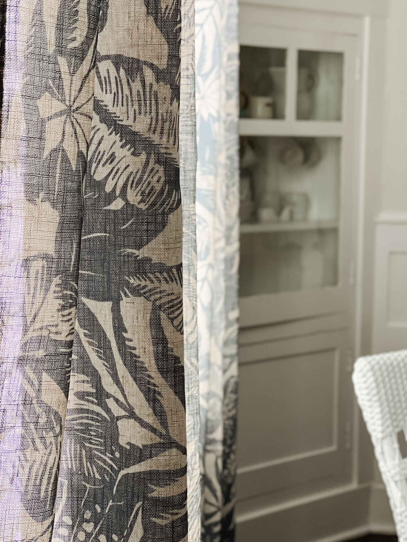
And then I’ll leave here today with a picture of our curtains. I still really love these curtains. I blogged all about them HERE.
What do you think? Any questions about anything? Let me know in a comment below or come chat with me on Facebook and/or Instagram.
If you like today’s post, you are welcome to PIN it along with any of the images from my blog on PINTEREST. Find a Pin It button by hovering over any of the pictures.
If you like the type of decor that I share, then be sure to check out my SHOP MY FAVORITES Page. I keep it updated with all of the fun Coastal, Cottage, and Farmhouse Decor that I come across on a daily basis. I personally want EVERYTHING that I have listed there.
You can also Check out my Amazon Page HERE. It too is full of all sorts of favorites.
Thanks for stopping by today,
Emily

It’s all so beautiful!! I love every little detail. The gallery wall in between the corner hutches is meant to be!
Author
Thank you Katrin! So sweet of you to say. 😊
Definitely loving the light and bright look! The picture wall really sets off the cute corner units. Somehow the room seems larger, too. Well done!
Author
Thank you So Much Laura! 🤗 The room does feel so much lighter, brighter, and your right, even larger! I love the magic of Paint.